Posted on

Just Play (again)

Kids really are the best. They live life like they really mean every minute of it.They go everywhere at a gallop until they’re too pooped to go on, and rarely giving much thought to what happens next. When they do give it some thought, it’s with the faith that it’s probably going to be AWESOME!

I figured the TD Art Gallery Paint-in was going to leave me exhausted and spent. There was a lot of “peopling” going on, which I’m really not used to. It turns out that the exact opposite happened and the day left me energized and inspired. That’s at least in part due to the time I spent making “colour wheels” with the kids. A lot of them knew mostly how colour works, but to see their eyes light up when skeins of yellow paint rolled over red to make orange was pure magic.

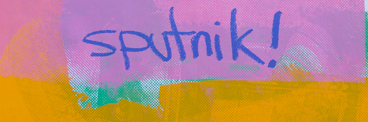
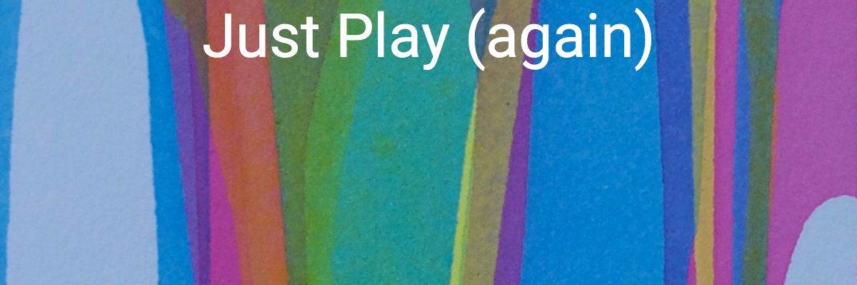
So, inspired by the kids I met on Moss Street, I decided to return to where it all started, with the “Just Play” series. Amazing things can happen when I approach a new project without expectations of the outcome. Painting for the sheer joy of seeing the colours materialize in front of my eyes. I suspect “Just Play” will become my touchstone when I start taking myself too seriously, or when I’m bent on the outcome of one project or another.

You can read more about the “Just Play” series here, and check out more of the actual work here.

Posted on 2 Comments

On your way out, or back….

Up to six of my recent paintings will be going up at Victoria International Airport on Monday for an extended show through October 15, 2018.

I’m incredibly grateful to Victoria Arts Council, CRD, and British Columbia Arts Council for their commitment to the arts in BC, and for providing such awesome opportunities for us to show people what we do.

If you’re on your way to, or from, somewhere exotic, check them out!  Either way, happy vacation!

Posted on

Nothing Wasted

It was March 2016 and I was walking along a beach in James Bay when I noticed the leftovers of a beach fire someone had set.  For some reason the charcoal looked beautiful to me, it reminded me of a crow wing or feathers.  I went to have a closer look and realized that I could probably use the charcoal to draw with and so I took some home.

At the time, I still wasn’t drawing or painting much of anything, I just took the charcoal home with me because I like the idea of it, put it in a box and filed it away with all my other art supplies.  I guess I was just intrigued by the idea that someone else’s waste could become the raw materials for something entirely new.

I found that charcoal again recently and decided to finally put it to use.  I was getting a little tired of painting anyhow and had decided to work on my drawing for a bit.  The “Nothing Wasted” series is the result.  Take a look around and let me know what you think.

Posted on

Recursion Studies

This one’s hard to explain.  It’s one of those times when very disparate ideas come together.

In my life as a developer, I’ve been preoccupied for the last little while developing a task management tool I actually like using.  It’s not easy because I use a technique called recursive deconstruction:  take one task and break it down into parts, then break down those parts into parts, and so on, and so on, until you’ve got a whole pile of little tasks you can take quick action on, pick up and put down within a few minutes.  Problem with most task management tools is there’s a limit to the recursion you can do – you can only ever break things down two, maybe three times and then you’re done.


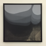
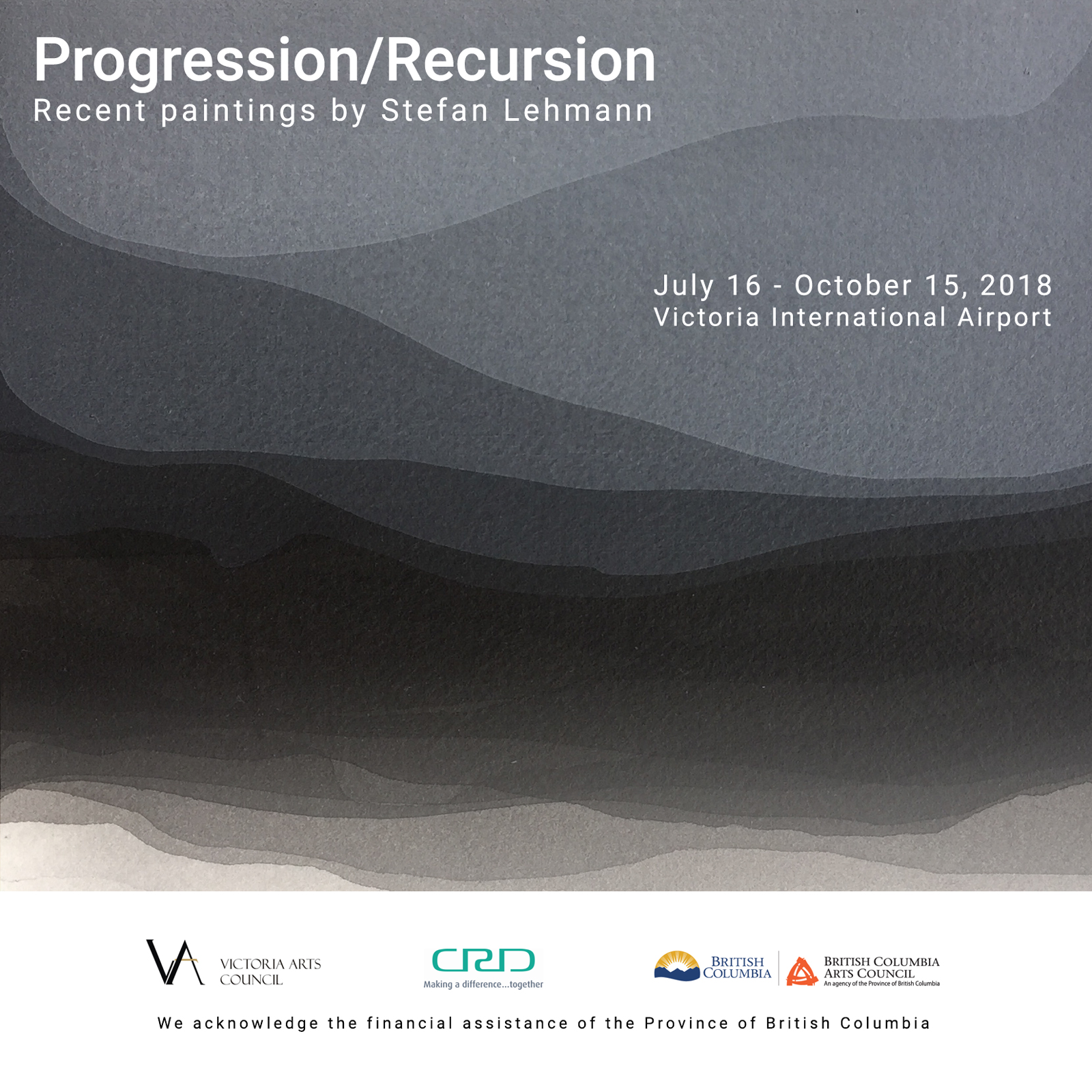
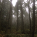
When I go trail running, I often get these beautiful views of the trees in the forest, receding into atmospheric perspective.  The effect is highlighted by the fog that often covers hillsides in the forests of the Pacific North West.  As the trees recede into real perspective, they also get smaller, which also happens to the space between them.  So the landscape becomes an illustration of the work I’m doing with recursion in my web development.


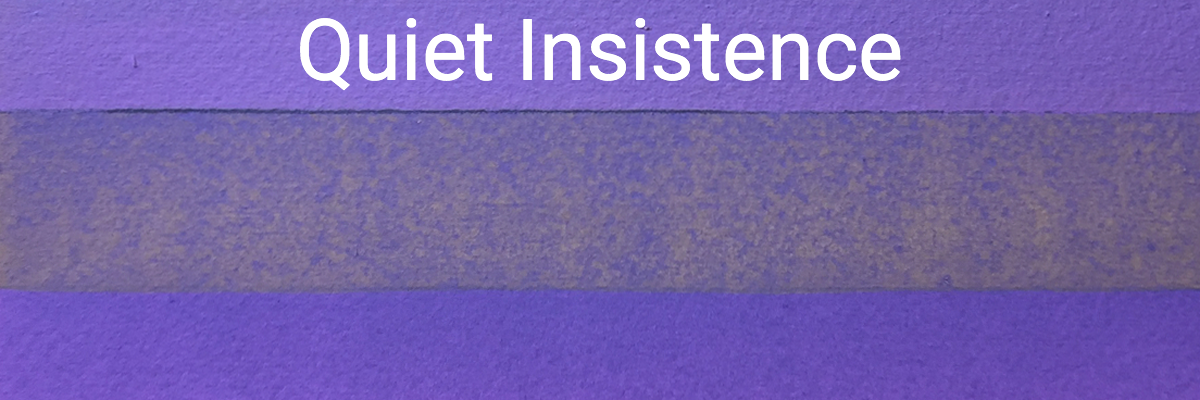
I’ve been looking for a way to paint landscapes without becoming a landscape painter.  What I’d like to learn to do is to evoke a sense of the landscapes in which I live that’s more than simply a photographic representation.  It’s more than emotion too.  There’s a deep logic to the landscapes in this part of the world that just feels right to me and which I’m not sure I’ll ever be able to articulate in words.  Hopefully I’ll get there visually though.

So really, this series is a bunch of ideas coming together at once.  I don’t quite think I’ve cracked the structure or method of these paintings yet, so I’m continuing to work on them in greyscale until I’ve got a little more confidence.  Take a look around the “Recursion Series”, and let me know what you think.

Posted on

Sputnik!

In Russian, “sputnik” means “Satellite”, or “Fellow Traveller”.  I’ve been fascinated by the story of Sputnik I since I was a little kid: this little hunk of metal and plastic that zipped around the world saying, “beep. beep. beeeeeeep…”.  I also found it incredibly funny how this little tyke could be so threatening to the US political system.

I’ve mentioned digging through my collection of old drawings in the “Echoes Series” and letting some of them go. One of the things I didn’t mention finding was a little pile of half-finished screen prints.  I don’t remember exactly why I abandoned them.  Perhaps I just didn’t know what to do next with them, or maybe I just lost interest and wandered off.  It was an interesting reminder of the curious kid I used to be.  I was experimenting with different ways to make images using silk screen techniques.  I had a few prepared screens and would layer partial prints up in different colours.  The effect is beautiful, but unfinished.

I spent some time looking at these unfinished pictures and made a decision to finish them.

It was an intuitive decision – I really liked them, and I couldn’t believe I’d just set them aside like I did.  What came next was really interesting. I basically started a collaboration with my 26 year old self.  And I’m not just commenting on the past, the process has become as much about me learning from 26 year old Stefan as it is completing something he left unfinished.  Rediscovering the kid I used to be is a bit like discovering I’ve got a fellow traveller that maybe it’s time to get to know a little better.

Stay tuned…there are more of these to come.  I count about 10 of these prints I’ll be working on finishing in the near future.

Take a look at what I’ve got so far and let me know what you think.

Posted on

Progression Studies

The name of this series comes from the progressive layering of thin layers of ink.  I’d done a lot with progressive darkening using thin washes of translucent pigments. What I hadn’t experimented with before was thin layers of light, opaque colours.  For some reason, I had this idea in my head that they’d always get really granular and gross looking.  To some extent, that’s true – but I found that mixing in enough gel medium would suspend the grains of opaque pigment long enough for them to cure in place instead of curdling.

Photo of Progression I
“Progression I”, 2018, Acrylic on wood panel. The first painting I ever sold.

What really sets this series apart though is that most of them are about patient layering through the full cycle of darkening from white paper to almost black and then lightening back up to almost white again.  Some of them contain 30 or 40 individual layers of wash.  It’s an old technique that goes back to the old masters.  As a result, there’s a strong sense of illusory depth to these pictures – progressive recession and then procession – that suggested to me that this might be a way of doing landscapes.

A couple of people have pointed out that some of the shapes in these paintings suggest some of the motifs in Pacific Northwest native art.  It’s got me thinking about inspiration versus appropriation.  They certainly aren’t intentional allusions to native motifs, but the comments have me thinking more about where the line can and ought to be drawn.  I should have a chat with some of the artists I know around here, native and non-native, and see what comes of it.

On another note, that these studies ended up becoming a larger painting (“Progression I”) which ended up being the first painting I sold.

Take a look through the “Progression Series”, and let me know what you think.

Posted on

Strange Semaphore

Let’s get the title of this series out of the way.  Jill thought they looked like the flags they use on boats, so that’s what they’re called.  They’re not a secret system of signs and signals.  They’re not any kind of semaphore at all, really.

What they really are is an abuse of art paper.  I got really interested in how folding, tearing, abrading, and otherwise abusing paper affected the absorptions rate of water and pigment.  I also hate blank paper.  It seems unnatural, and it’s terrifying to me.  Confronted with a blank sheet, I develop options paralysis and have no clue how to start.  ‘Preparing” the paper is a way for me to get past that barrier.

This was also my first use of a square format.  For whatever reason I’ve always avoided squares, and this was an easy way for me to just get over that.  In folding the paper, I explored some of the geometry of squares too, sometimes using hard symmetry, sometimes the rule of thirds. Diagonals and harlequins came next.

Besides the bright colours and high contrast of these pictures, one of the things I like about them is the flexibility in displaying them:  when framed, each them have 8 different ways to hang them.  Which brings up an interesting point: I get asked sometimes why I don’t sign my paintings.  At least part of the reason is so that anyone purchasing them is free to hang them any way they like.

Anyway, take a look at the “Strange Semphore” pictures and let me know what you think.

Posted on 1 Comment

Spring Matrices

The word matrix means a lot of different things to different people. I know the expression from direct marketing to mean a simple x/y grid.  I also know it from print-making to mean whatever is used, with ink, to hold the image that makes up the print. To the biologist, matrices are the tissues in animal or plant cells, in which more specialized structures are embedded.  The nerd in me can’t see the word without thinking of the late 90s movie starring Keanu Reeves.

Most fascinating to me when I looked it up is that the word matrix comes from the latin root “Mater” meaning mother.

Having tired of stripes doing the “Quiet Insistence” paintings, I moved on to working with grids. It was an intuition, and I knew Agnes Martin had worked in grids too. That scientific, logical part of my brain seemed to think it was the right move, just adding one more coordinate/variable to the practice I’d already been enjoying.

What happened next was really interesting. Whereas with the stripe paintings I pretty much did my level best to “colour inside the lines”, as soon as I got working with a grid the game changed and I started consciously evading the lines. Or rather, I was sticking to the general rule of the grid, but nudging the paint to break the lines here and there. Layers of paint would overlap, not not quite completely, the better to emphasize the layering.  Looking back on them, the grid itself is still very apparent, but it’s like I used it as a lattice upon which to let the paintings grow along their own course.

It’s almost like the grid was there to nurture the process, saying in effect, “Don’t Panic!”. As with the strip paintings, the grid absolved me of the need to plan out a picture and let me just play, but this time it was with some pretty complex layering of colour, opacity, shade, and intensity.

The term “Spring Matrices” came from the fact that I was doing these paintings early in the West Coast spring and that a lot of the colours were inspired by the season. I’ve pulled together some of the Spring Matrices paintings here. Take a look and let me know what you think.

Posted on

Quiet Insistence

I can remember visiting the AGO (Art Gallery if Ontario) in my early twenties and  falling in love with Agnes Martin’s paintings.  Among all the big, bright, brash American art of the 60s and 70s in the contemporary galleries, one of Agnes Martin’s paintings stood out to me with a quiet insistence that still surprises me.

Sometimes incredibly subtle in her use of colour, or obsessive grids, I fell for her paintings in a way that’s pretty rare for me.  In some cases there’s so little actually there that I’m surprised I can spend so much time with them.  I still love her paintings, and in fact Jill gave me a catalogue of her paintings for my 46th birthday.

For anyone who’s ever struggled with mental illness or know someone who has, I encourage you to read her biography as well as look at her paintings.  She led a long and productive career in the visual arts despite her struggles.

When I started painting again, I painted in stripes and grids for purely pragmatic reasons, but always with those early experiences of Martin’s paintings in mind.  Freed from the need for a subject, I could focus on basic elements of design: line, colour, without worrying too much about form.   I also got to explore the physical elements of paint, water, and paper.  I tried folding, tearing and ripping the paper in preparation for the paint, noticed how these preparations affected the absorption rate of water and pigment.  I played with fairly thick layers as well as almost completely translucent washes.  

In the end, I suspect I found something of what Agnes Martin’s process must have been like.  It was very meditative, the mind getting quiet enough to contemplate little other than what colour, size, opacity and form the next line should take.

I’ve pulled together some of those early stripe paintings into a series I’ve called “Quiet Insistence”.  Take a look around and let me know what you think.

Posted on

I’m In!

I just found out that I’ve been selected to participate in the 2018 TD Art Gallery Paint-In!  Victoria people will probably know it better as the Moss Street Paint-In.

I’m excited as heck.  Jill and Miriam have offered to help out that day, and we’ll be doing something interactive for the kids (and kids at heart),  playing with paint and paper and learning about subtractive colour theory in the process.

I’m also a little terrified.  This will be the first public exhibition of my art in 24 years.  It’ll be interesting to see what people make of it.

So, if you’re in town on July 21, 2018, swing by Moss street and come visit!

Bring iced lattes if you do 😉