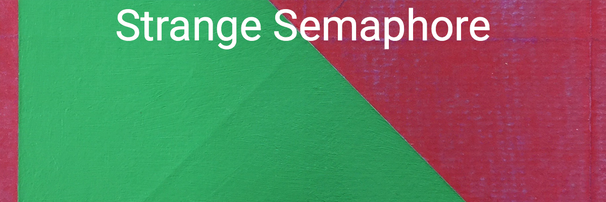
Let’s get the title of this series out of the way. Jill thought they looked like the flags they use on boats, so that’s what they’re called. They’re not a secret system of signs and signals. They’re not any kind of semaphore at all, really.
What they really are is an abuse of art paper. I got really interested in how folding, tearing, abrading, and otherwise abusing paper affected the absorptions rate of water and pigment. I also hate blank paper. It seems unnatural, and it’s terrifying to me. Confronted with a blank sheet, I develop options paralysis and have no clue how to start. ‘Preparing” the paper is a way for me to get past that barrier.
This was also my first use of a square format. For whatever reason I’ve always avoided squares, and this was an easy way for me to just get over that. In folding the paper, I explored some of the geometry of squares too, sometimes using hard symmetry, sometimes the rule of thirds. Diagonals and harlequins came next.
Besides the bright colours and high contrast of these pictures, one of the things I like about them is the flexibility in displaying them: when framed, each them have 8 different ways to hang them. Which brings up an interesting point: I get asked sometimes why I don’t sign my paintings. At least part of the reason is so that anyone purchasing them is free to hang them any way they like.
Anyway, take a look at the “Strange Semphore” pictures and let me know what you think.